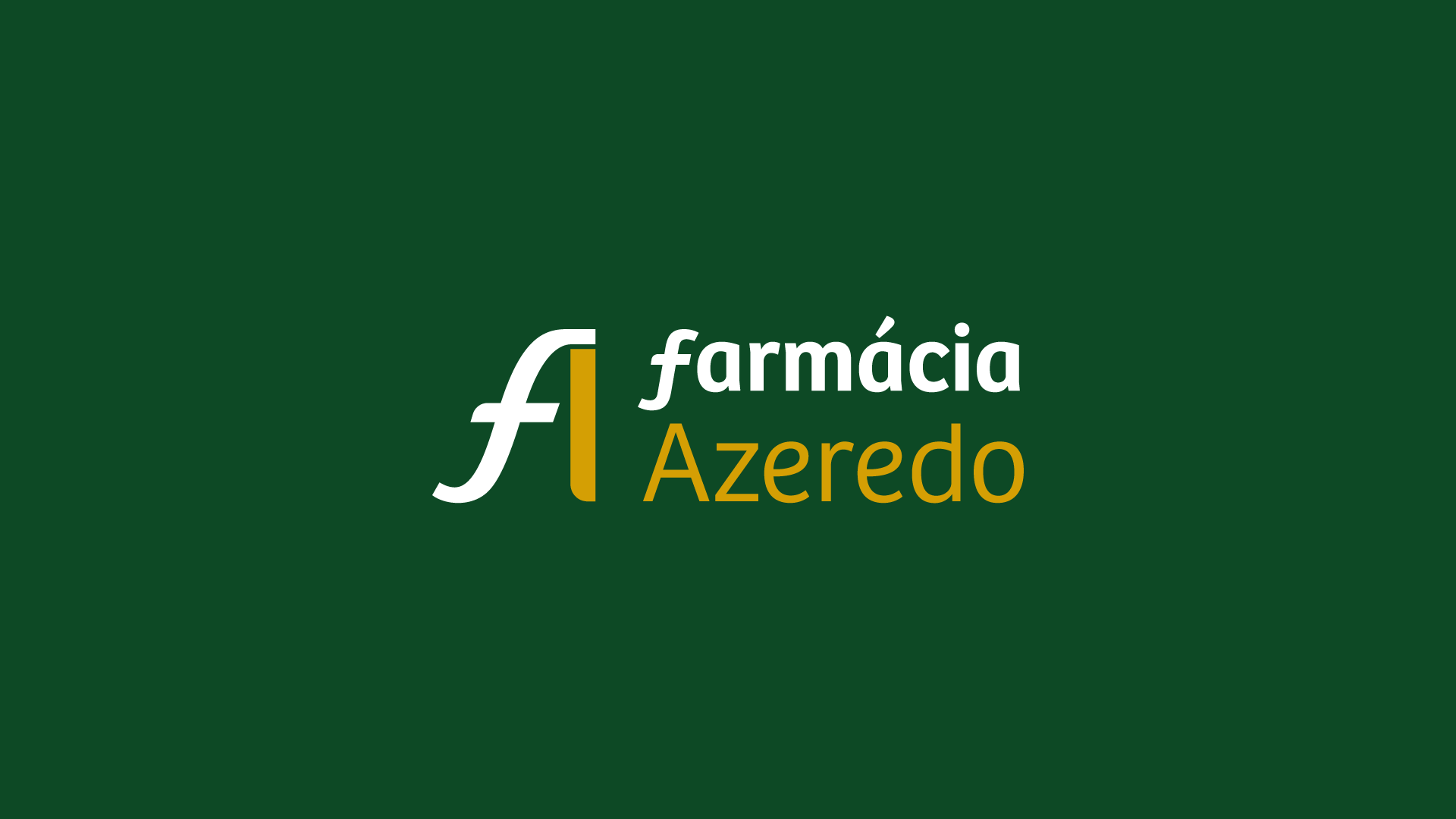
Farmácia Azeredo
New Identity for Farmácia Azeredo
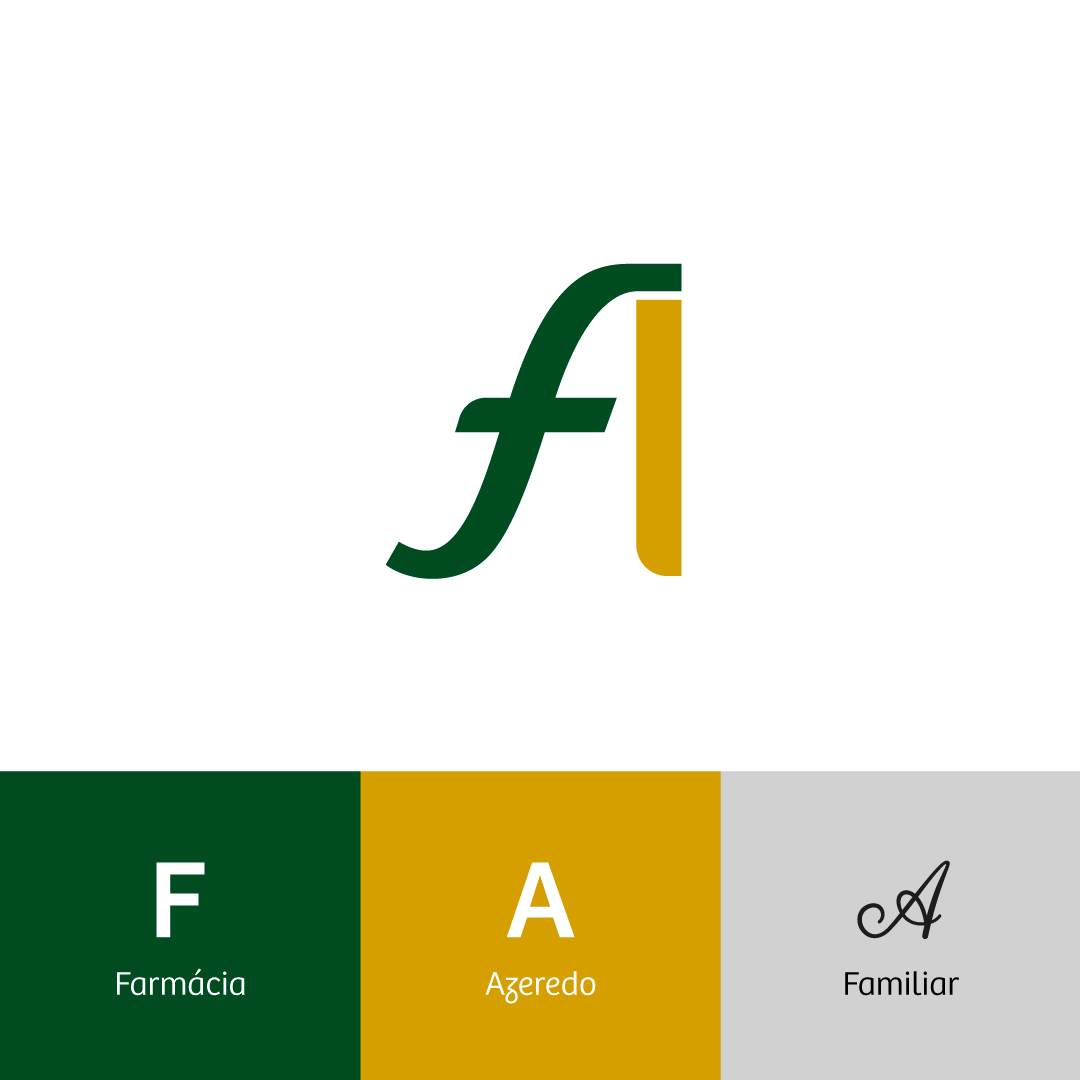
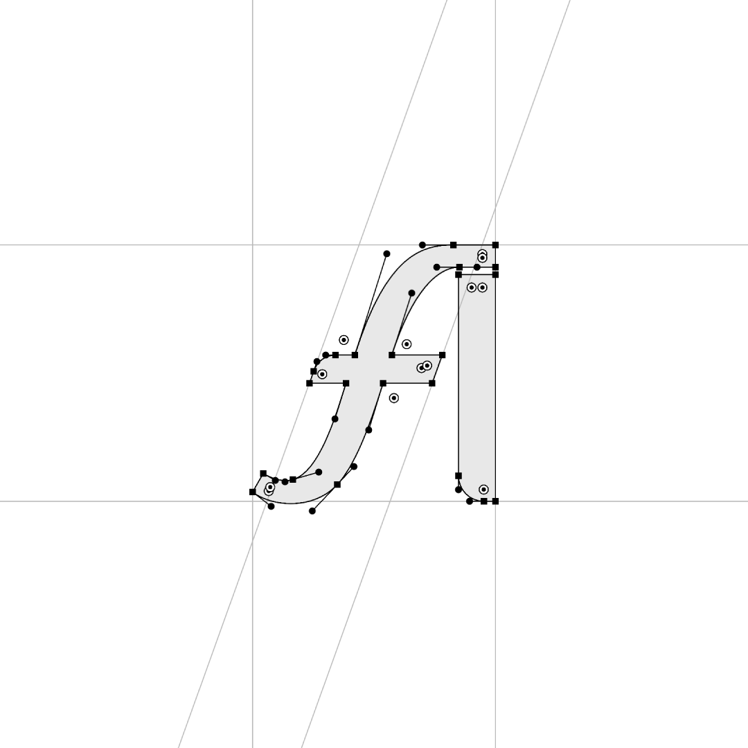
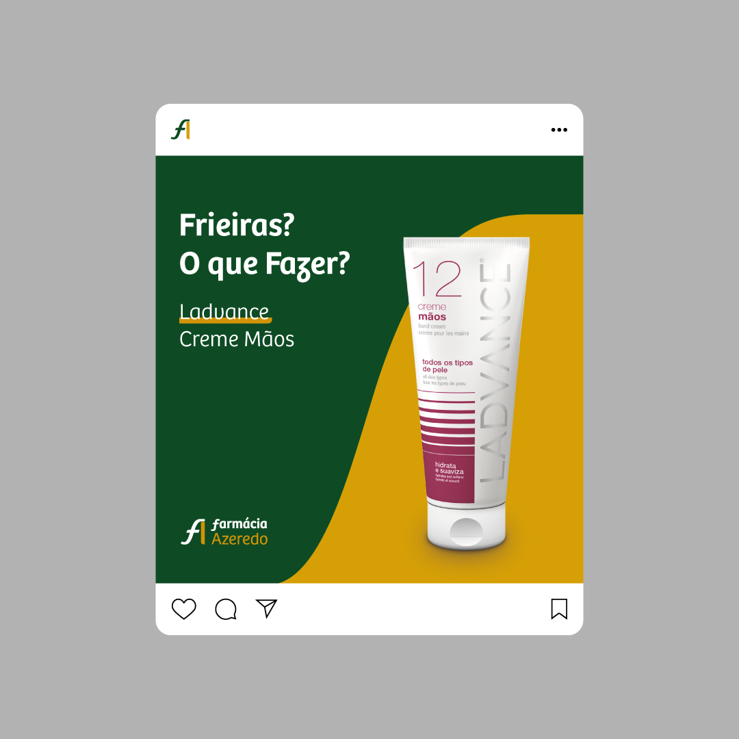
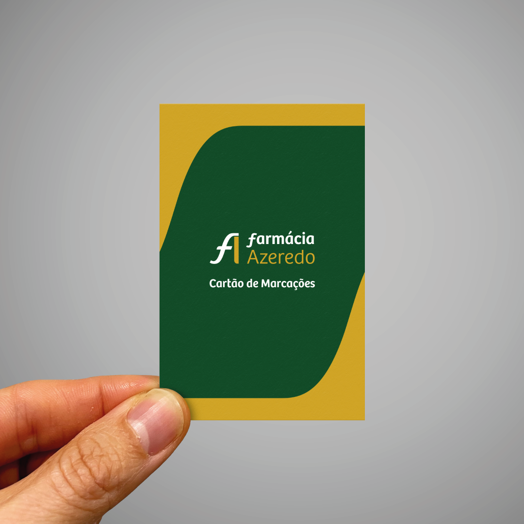
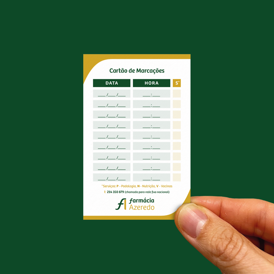
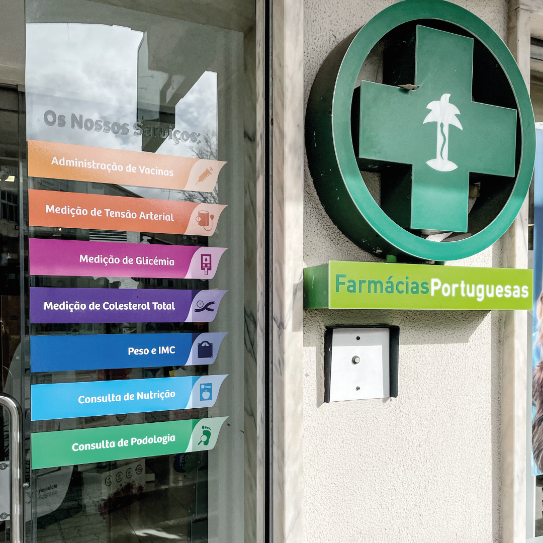
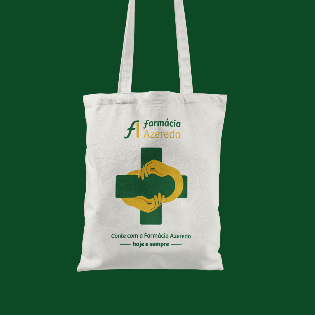
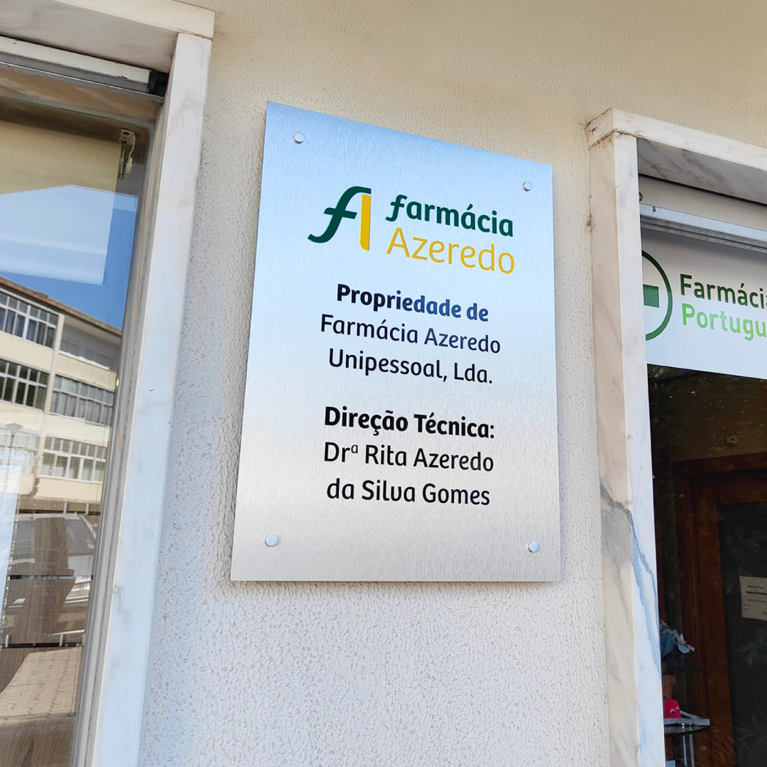
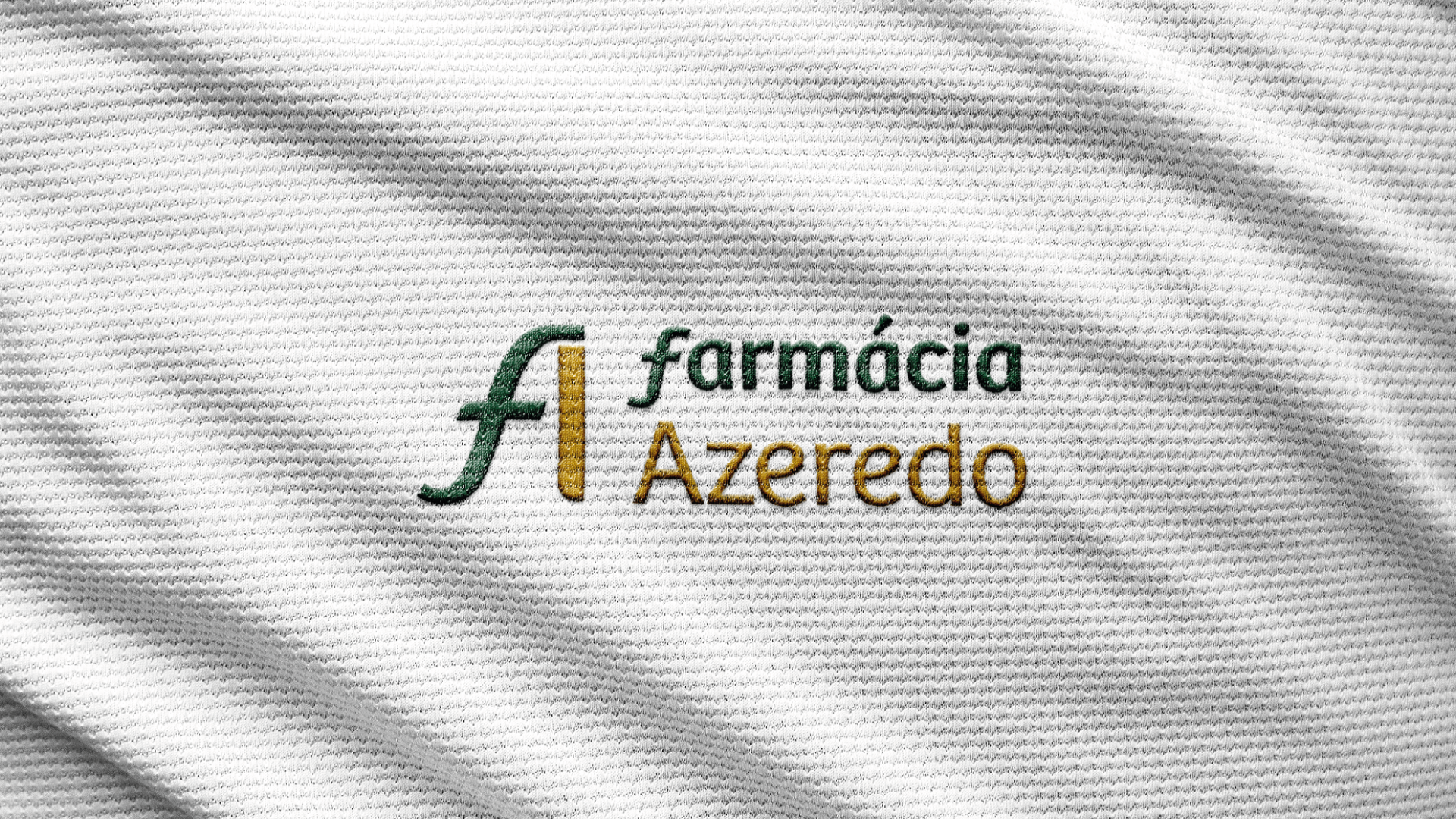
Focusing on the initials F and A, the solution involved developing a symbol that expressed both the familiar and welcoming nature that characterizes this pharmacy, as well as ensuring professionalism, relevance, and personality across the various platforms and media where the brand is present.
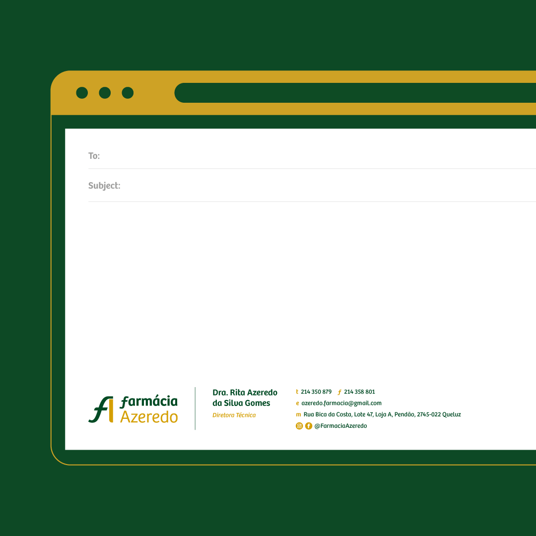
Branding | Graphic Design